Fuel efficiency in the Sprinter
I have been endeavoring to keep track of fuel economy in pretty much every vehicle I’ve owned since the Suburban (which, thanks to a 454CI engine was an exercise in misery) and with the Sprinter I’ve actually done a rather exceptional job at it. I have fuel fill data along with service records for over 150,000KM with absolutely no dropped data - I pretty much can tell you down to the cent what the total cost of ownership of this van is. aCar is basically an invaluable tool for this process, and it’s absolutely worth the money (and the app developer supports it extremely well).
But what to do with that data? I’d been considering selling the van (since used Mercedes Sprinters have actually appreciated since I bought it!) and doing something else with my time, and I ended up getting side-tracked on the question “am I using more fuel than I used to?”
I spent a while fooling around with the data (which handily I can export to CSV in a format which requires only minor munging to be useful) - the first step was throwing away data which isn’t useful, since aCar exports multiple tables into a single CSV file. I also threw away the headers, because I don’t really need them.
I then started out (upon the suggestion of Darius on IRC) using numpy’s least-squares function in an attempt to smooth out the very noisy data points:
#! /usr/bin/python

import csv
from numpy import *
import matplotlib.pyplot as plt

# suck in mileage values from csv file (exported from aCar)
with open('mileage.csv', 'rb') as f:
	c = csv.reader(f, delimiter=',', quotechar='"')
	index = []
	mileage = []
	count = 0

	for row in c:
		if float(row[12]) > 0.0:
			count = count + 1
			mileage.append(float(row[12]))
			index.append(int(row[3].replace(",","")))

m = array(mileage)
t = array(index)

A = array([index, ones(len(index))])

coeffs = polyfit(t, m, 20)
f = poly1d(coeffs)
y_est = f(t)

plt.plot(t, m, '-', label = 'Raw Data', markersize=5)
plt.plot(t, y_est, '-', label = 'Estimated Average', markersize=1)
plt.xlabel('Odometer Reading')
plt.ylabel('L/100KM')
plt.show()
Note that this is just the results of a few minutes hacking, and the code above is not indicative of the sort of Python I’ll put out when I’m actually writing something I care about. The results aren’t super great, and I’m probably committing horrific errors that’ll make statistics and/or linear algebra folks’ heads spin. I lifted several bits of the above code from various numpy examples and didn’t attribute any of it, unfortunately.
It did make a thing though, and I learned a little bit in the process… primarily, how fucking woefully inadequate my mathematics education is at this point.
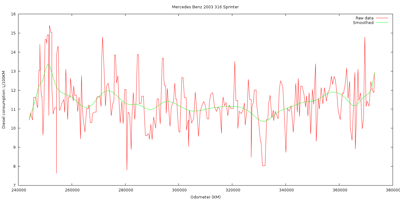
Yesterday, Peter on IRC showed off his data that he’d rendered using gnuplot, so I knocked out a script real quick to do it (after converting the data to a usable format using Python, as the CSV file aCar outputs is unreadable to gnuplot because of the commas in the odometer field):
set terminal pngcairo size 1300,650 enhanced font 'Verdana,10'
set output 'mileage.png'
set ylabel "Diesel consumption: L/100KM"
set xlabel "Odometer (KM)"
set title "Mercedes Benz 2003 316 Sprinter"
plot "mileage.dat" using 1:2 with lines title "Raw data", "mileage.dat" using 1:2 smooth sbezier title "Smoothed"
I’m a lot happier with these results as I feel there’s less algebra fuckery on my behalf involved:
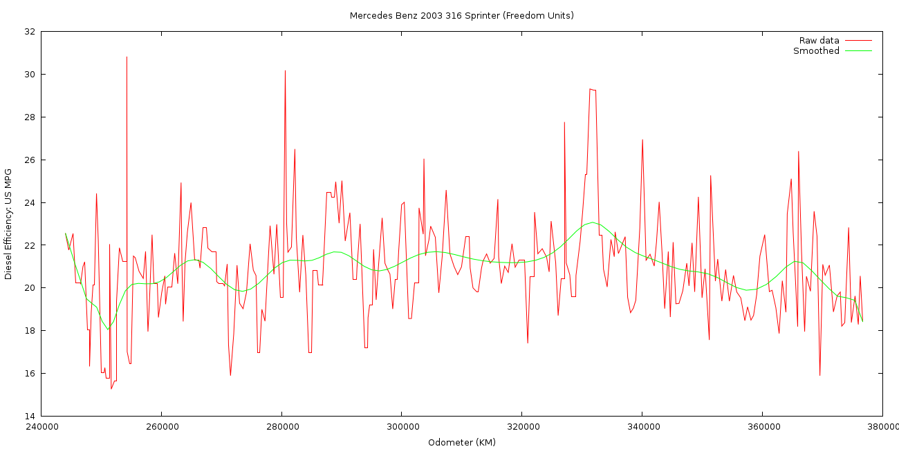
I’ve also created the same graph showing Miles per US Gallon as well because a lot of the time my brain still thinks in those units, despite MPG being an utterly nonsensical measurement of fuel consumption for an Australian.
Am I any closer to answering the question posed above? Not really, no. There are simply way too many variables involved: completely different driving styles, conditions, fuel qualities and not to mention going the first few thousand KM without a turbocharger at all to really chuck a spanner in the works.
One thing that’s interesting to note: gnuplot’s SVG output produced something that’s error prone, which sucks because I’d have liked to use that instead of a bitmap image.
 fwaggle
Published:
Modified:
Filed under:
Location:
Horsham, VIC, AustraliaNavigation: Older Entry Newer Entry